
Creating a Module federated UI library with Webpack 5
In my previous post Micro frontends with Module Federation and Webpack 5, we looked at how to utilise the new Module Federation plugin available with Webpack 5 (MF) to chop up a SPA into multiple, independently owned micro-frontends.
In this post we'll look into how we can use Module Federation to create a federated UI library to share with multiple teams.
Setup
Since this post is about showcasing a component UI library, I am going to skip some of the setup boilerplate explained in my last post and walk you through what we’re working with.
Just as last time we're using a monorepo for convenience and an app shell containing two routes - the base route and the ui catalog route.
Setup - Monorepo
sites contains both the consuming app and the ui library
 "private": true,
  "scripts": {
    "installDependencies": "yarn workspaces run deps",
    "build": "yarn workspaces run build",
    "start": "concurrently \"wsrun --parallel start\"",
    "clean": "rm -fr node_modules sites/**/node_modules && yarn run clean:dist",
    "clean:dist": "rm -fr node_modules sites/**/dist"
  },
  "workspaces": [
    "sites/*"
  ],
"private": true,
"scripts": {
"installDependencies": "yarn workspaces run deps",
"build": "yarn workspaces run build",
"start": "concurrently \"wsrun --parallel start\"",
"clean": "rm -fr node_modules sites/**/node_modules && yarn run clean:dist",
"clean:dist": "rm -fr node_modules sites/**/dist"
},
"workspaces": [
"sites/*"
],Setup - Sites/Shell
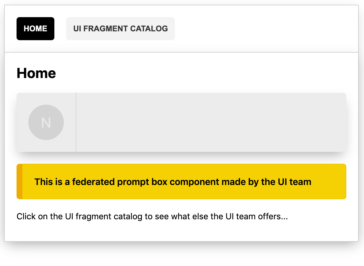
App shell sets up the routes for our SPA
App shell sets up the routes for our SPA
const Home = React.lazy(() => import('team-home/Home'));
const Catalog = React.lazy(() => import('team-ui/Catalog'));
const Routes = () => {
  return (
    <Router>
      <nav>
        <LinksWrapper />
      </nav>
      <Switch>
        <Route path="/" exact>
          <React.Suspense fallback={/* home fallback */}>
            <Home />
          </React.Suspense>
        </Route>
        <Route path="/catalog">
          <React.Suspense fallback={/* catalog fallback */}>
            <Catalog />
          </React.Suspense>
        </Route>
      </Switch>
    </Router>
  );
};
const Home = React.lazy(() => import('team-home/Home'));
const Catalog = React.lazy(() => import('team-ui/Catalog'));
const Routes = () => {
return (
<Router>
<nav>
<LinksWrapper />
</nav>
<Switch>
<Route path="/" exact>
<React.Suspense fallback={/* home fallback */}>
<Home />
</React.Suspense>
</Route>
<Route path="/catalog">
<React.Suspense fallback={/* catalog fallback */}>
<Catalog />
</React.Suspense>
</Route>
</Switch>
</Router>
);
};Setup - Sites/Home
Consumer "Home" application using the shared ui library and aliases it as team-ui
Consumer "Home" application using the shared ui library and aliases it as team-ui
new ModuleFederationPlugin({
  name: "home",
  filename: "remoteEntry.js",
  remotes: {
    "team-ui": "ui@http://localhost:5000/remoteEntry.js"
  },
  shared: {
    ...deps,
    react: {
      singleton: true,
      requiredVersion: deps.react,
    },
    "react-dom": {
      singleton: true,
      requiredVersion: deps["react-dom"],
    },
  },
}),
new ModuleFederationPlugin({
name: "home",
filename: "remoteEntry.js",
remotes: {
"team-ui": "ui@http://localhost:5000/remoteEntry.js"
},
shared: {
...deps,
react: {
singleton: true,
requiredVersion: deps.react,
},
"react-dom": {
singleton: true,
requiredVersion: deps["react-dom"],
},
},
}),Recap - setup
sites folder - the app shell, the home application and the ui library
UI Library
Now on to the actual UI library exposed by the UI team through MF, btw - read my previous post about micro-frontends SPAs using MF if you feel you need more examples to follow along.
First of, let´s look at the remote and the exposes properties of the UI team top to bottom:
UI webpack.config.js
UI webpack.config.js
new ModuleFederationPlugin({
  remotes: {
    "team-ui": "ui@http://localhost:3001/remoteEntry.js",
  },
  exposes: {
    "./BaseStyles": "./src/federated/styles/base.css",
    "./Components": "./src/federated/components/",
    "./Catalog": "./src/federated/catalog/",
    "./Components/Utils": "./src/federated/components/utils/"
  },
}),
new ModuleFederationPlugin({
remotes: {
"team-ui": "ui@http://localhost:3001/remoteEntry.js",
},
exposes: {
"./BaseStyles": "./src/federated/styles/base.css",
"./Components": "./src/federated/components/",
"./Catalog": "./src/federated/catalog/",
"./Components/Utils": "./src/federated/components/utils/"
},
}),BaseStyles - e.g styles for wrapping a page, base fonts etc...
Components - index file exporting named exports from each category
Components - index file exporting named exports from each category
export * from './Buttons';
export * from './Headings';
export * from './Boxs';
export * from './Flexs';
export * from './Sections';
export * from './Dividers';
export * from './Texts';
export * from './Avatars';
export * from './Buttons';
export * from './Headings';
export * from './Boxs';
export * from './Flexs';
export * from './Sections';
export * from './Dividers';
export * from './Texts';
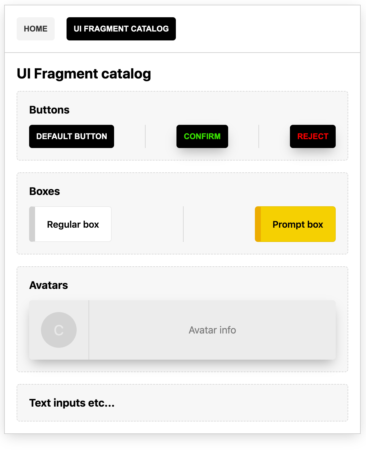
export * from './Avatars';Catalog - the UI fragment catalog showcased by the UI team
Catalog - the UI fragment catalog showcased by the UI team
import 'team-ui/BaseStyles';
import {
  ConfirmButton,
  RejectButton,
  Button,
  Heading,
  Box,
  PromptBox,
  FlexSpread,
  Section,
  Divider,
  AvatarBox
} from 'team-ui/Components';

const Catalog = () => (
  <div className="page">
    <Heading mT={0} as="h1">
      UI Fragment catalog
    </Heading>
    <div>
      <Section>
        <Heading mT={0} as="h2">
          Buttons
        </Heading>
        <FlexSpread>
          <Button>DEFAULT BUTTON</Button>
          <Divider />
          <ConfirmButton sh onClick={() => console.log('confirm')}>
            Confirm
          </ConfirmButton>
          <Divider />
          <RejectButton sh onClick={() => console.log('reject')}>
            Reject
          </RejectButton>
        </FlexSpread>
      </Section>
      {/* ... */}
    </div>
  </div>
);
import 'team-ui/BaseStyles';
import {
ConfirmButton,
RejectButton,
Button,
Heading,
Box,
PromptBox,
FlexSpread,
Section,
Divider,
AvatarBox
} from 'team-ui/Components';
const Catalog = () => (
<div className="page">
<Heading mT={0} as="h1">
UI Fragment catalog
</Heading>
<div>
<Section>
<Heading mT={0} as="h2">
Buttons
</Heading>
<FlexSpread>
<Button>DEFAULT BUTTON</Button>
<Divider />
<ConfirmButton sh onClick={() => console.log('confirm')}>
Confirm
</ConfirmButton>
<Divider />
<RejectButton sh onClick={() => console.log('reject')}>
Reject
</RejectButton>
</FlexSpread>
</Section>
{/* ... */}
</div>
</div>
);
Components/Utils - a react specific prop sanitation utility
Federated utility
Federated utility
export const getValidProps = (props) => {
  const {
    customProp, /* (props for react) */,
    ...rest
  } = props;
  const invalid = null || undefined;

  const styles = {
    ...(customProp !== invalid && { something: customProp }),
  };

  return {
    props: rest,
    class: classAdd,
    styles
  };
};
export const getValidProps = (props) => {
const {
customProp, /* (props for react) */,
...rest
} = props;
const invalid = null || undefined;
const styles = {
...(customProp !== invalid && { something: customProp }),
};
return {
props: rest,
class: classAdd,
styles
};
};Recap - ui team
- Exposes a set of UI components
Showcases all available UI components by exposing micro-frontend called Catalog
Header component example
Header component example using the federated getValidProps utility
Header component example using the federated getValidProps utility
import './styles/ButtonStyles.css';
import { getValidProps } from 'team-ui/Components/Utils';

const BaseHeading = (props) => {
  const Props = getValidProps(props);
  const Tag = Props.tag;

  return (
    <Tag {...Props.props} style={{ ...Props.styles }}>
      {props.children}
    </Tag>
  );
};

export const Heading = (props) => <BaseHeading {...props} />;
import './styles/ButtonStyles.css';
import { getValidProps } from 'team-ui/Components/Utils';
const BaseHeading = (props) => {
const Props = getValidProps(props);
const Tag = Props.tag;
return (
<Tag {...Props.props} style={{ ...Props.styles }}>
{props.children}
</Tag>
);
};
export const Heading = (props) => <BaseHeading {...props} />;Summary
Creating a federated UI library this way works really well, and something that I feel could be quite advantageous for larger teams working with Single Page Applications wanting to have an option to NPM or the like.
If you're interested in how resilience comes to play using MF - e.g What happens if the server is down? I highly recommend you checking out Jack Herringtons's Youtube Video "How to build a resilient shared Header/Footer using Module Federation", where he walks you through the process of creating a resilient federated header / footer using a mix of techniques (including MF), custom React error boundaries and Yarn workspaces.
Like always, the code for this example is at my Github in case you feel like checking that out.
/ ND